
How to Make a Bad Logo
Bad Logos don’t want to be bad… they were just conceived without considering a few important things.
Dots vs Lines
Most regular people don’t talk about vector vs raster. Here’s the deal when it comes to corporate identity. You want your logo (and your business for that matter) to scale well. Basically when you make it large (billboard sized) or small (business card) the design needs to not lose resolution and show jagged edges. To accomplish this the designers use vector art tools (Adobe Illustrator, CorelDraw, etc.) to create designs that aren’t made of dots, but rather are shapes made of linework that can be infinitely scaled up or down without losing their quality.

Raster Image – you can see the jagged edges (incidentally most images you see online are raster which is why they make poor logos to use in print applications).

Vector Image – you can see this image has smooth edges and will scale up and down without losing visual quality.
Color
There are a few different reasons you need to be careful with color.
- Money – It’s generally more expensive to print in multiple colors so being able to choose when you use the single color version vs full color is a business ($$) decision. Don’t let your graphics put you in the poor house!
- It’s best to work in black and white until you have the shape really nailed down – then you can have fun with it 🙂

CrossFit Kilgore Logo BW
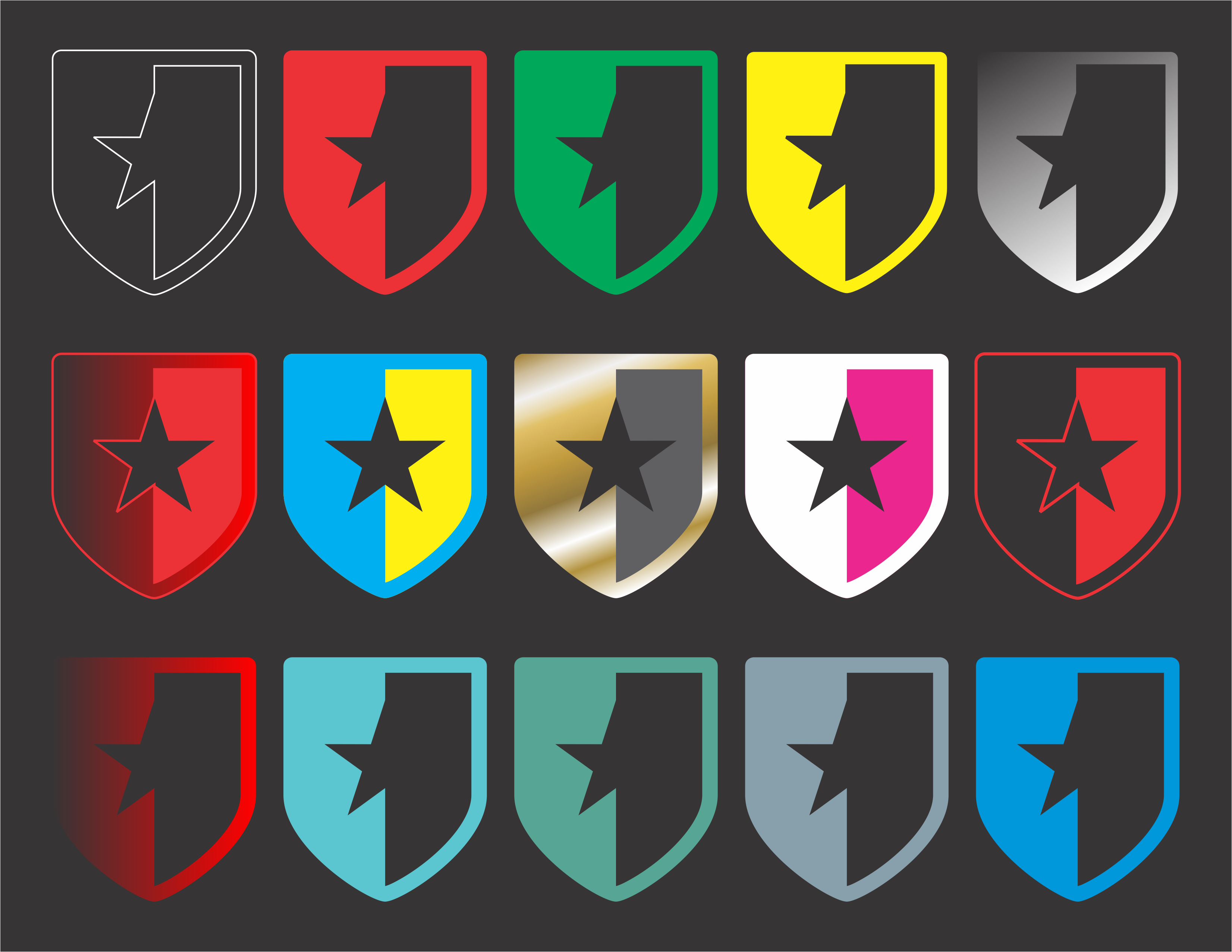
Having fun with colors
Other Tips
- Must have meaning – having a logo that’s just a publicity stunt is ok, but it won’t stand the test of time.
- Horizontal and Vertical – needs to work in multiple applications – portrait and landscape
- Font – there are tons of good web fonts that literally everyone can download and use. Try not to use a proprietary font that doesn’t exist everywhere. Your printer will thank you!
Contact us to visit and get a shape of your own!