
Why Mobile Matters
“It looks great on my phone”
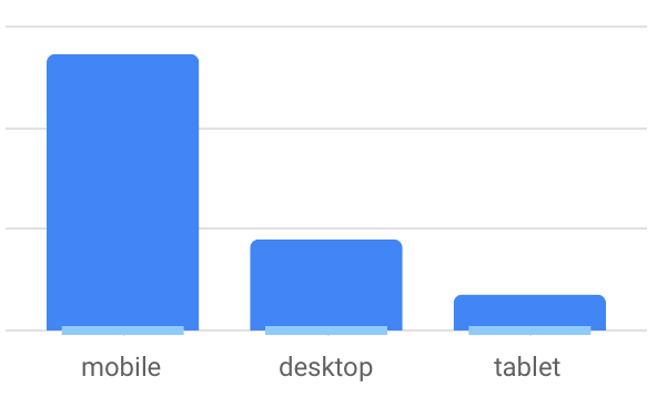
When a customer says this to me it makes me smile. The chart you see is real and shows just how much of our normal web traffic is mobile based.
When you add a tablet to it, you end up at the 75% mark. This isn’t for ALL sites, but it is becoming more and more normal as people adopt mobile computing over the traditional desktop/laptop computers.
 Your website is often the first impression a customer has of your company. When they “check you out” they often aren’t sitting at home or the office, but are much more likely to be at lunch, on a job site or out and about. It stands to reason they would use their phone to check you out, so you want your site to look and function at its best the first time they see it.
This is why I take mobile seriously and won’t create a site without it working 100% on mobile. Adding mobile on as an afterthought seems very backwards to me and ignores what your ultimate customer (the person visiting the site) will experience.
The sites I build are 100% responsive. That means no matter what resolution or shape your screen is the content will flow to fit it. Sometimes I have to make decisions on style to allow that flexibility, but I always think of your customer first.
Don’t settle for peeking through a hole to see your website! Contact me today and I’ll get you on your way to device independence!
Robert L. Brown